
Registration Process Iteration
UX/UI design internship project @Tencent Wechat Pay
Tool
Sketch, Miro
Duration
2 Weeks
My Roles
Refined the registration process of current facial recognition devices
Produced UI solutions

Frog Pro Device
Since 2018, WeChat Pay, a subsidiary of Tencent, has launched the WeChat facial recognition payment, an innovative payment method created by combining advanced technologies such as biometrics, AI artificial intelligence, big data intelligent risk control, and 3D cameras.
In August 2019, WeChat launched the "Frog Pro" devices, allowing customers to use a specific machine to make payments by simply scanning their face - without using their phone.
Today, the number of facial recognition payment users has reached tens of millions, providing an efficient, secure, and convenient consumer payment experience for various offline consumption scenarios, such as self-checkout machines in supermarkets, desktop cash registers, and vending machines.
Background
There are many management systems in Xiaohongshu, including the KOL management platform, seller center platform, etc. To set up a standard design system, the UX design team of Xiaohongshu has established design guidelines, hoping to create consistent experiences across different platforms and increase communication efficiency between designers and engineers.
However, the design guidelines are too complex to read and reuse directly. Designers need to spend a lot of time reading the instructions, resulting in low efficiency and high time cost.
Solution
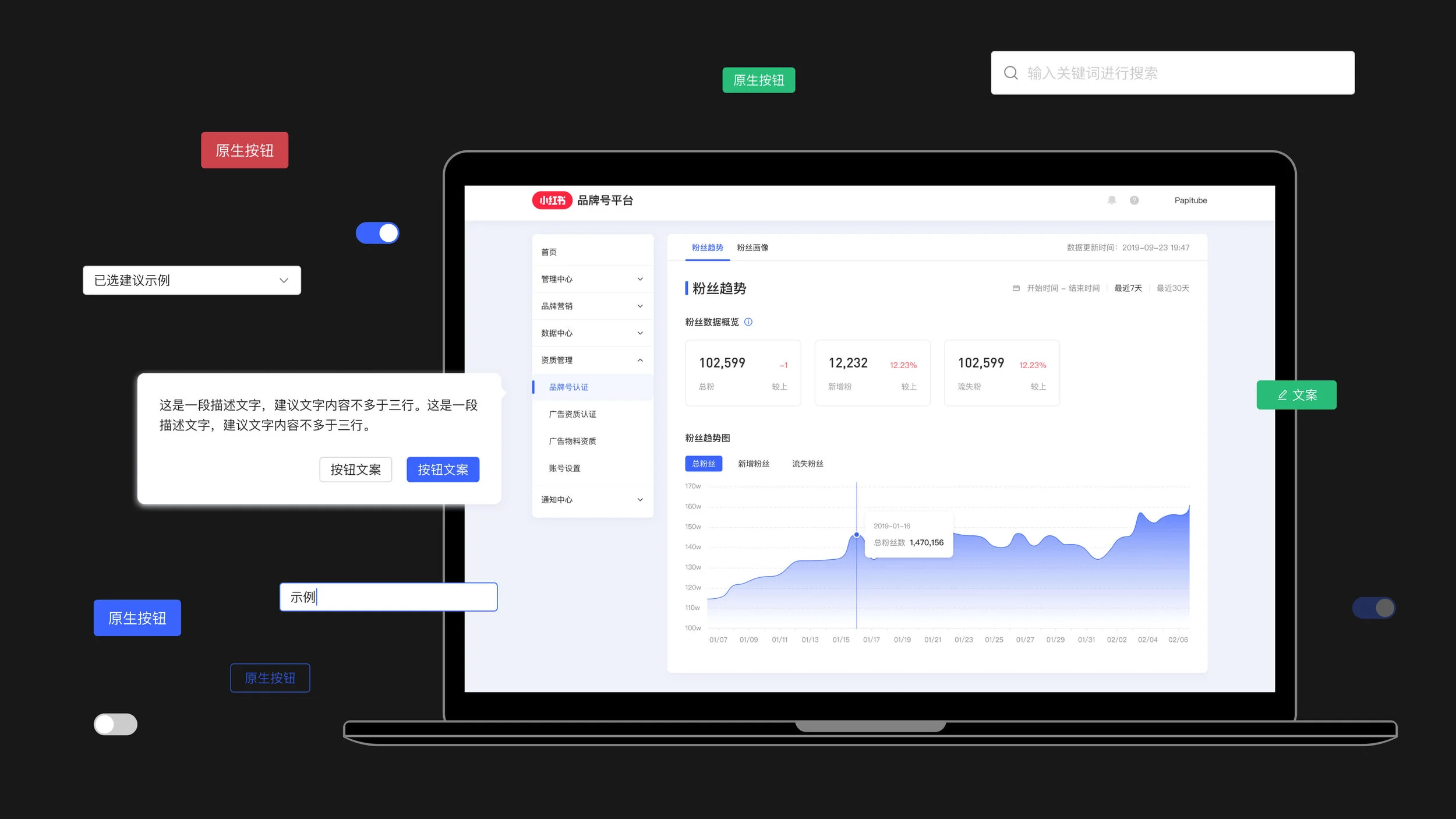
I rebuilt the components from the original design guidelines and made a lightweight UI kit, which reduced the text, and made it concise, easy to copy and use. Then, designers only need to focus on providing better design. Simultaneously, the convenient Figma features can help update the components with switchable styles and automatic layout changes according to content fillers, significantly improving efficiency.
Lightweight: Having a more refreshing and straightforward layout without complex texts. Paying attention to the visual essence and make it easy to understand.
Convenience: Through Figma's built-in functions, the UI kit can reduce redundant and tedious adjustment processes and improve efficiency.
Consistency: The UI kit is created based on existing design systems.
Design Process
The design process mainly includes four parts. Here are the descriptions of the Figma functions used in my design: Auto Layout, Constraints, Variants.
Examples

Modal boxes resize with their text
Elements can be nested to create complex pop-up modals that respond to their text content.

One-click style switch
Combining components of the same type with variants makes it easy to toggle specific properties with one click, and overrides are preserved.
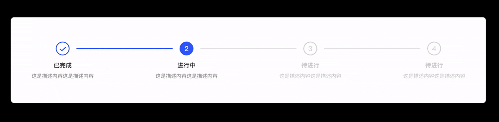
Auto-distribute space between elements
Combined with the Auto layout, Constraints, and Variants, a component can switch the element type and automatically allocate the element space according to the fixed length.
In this step component, the step element's length is fixed, you only need to copy and paste the step elements and connection lines in the component, and the component can re-layout the content within the fixed-length (Auto Layout). To fit in the component, the connection lines' lengths are adjusted according to the number of steps (Constraints). Every step can also toggle to another status through one click (Variants).
Reflection
Efficiency ranks first when we design the experiences for management systems.
Designing a UI kit is the same as creating any other page. Designers need the most intuitive style to make it easy for users to use, but this time the users are designers.
To make components more convenient and easy to use, we need to give full play to the design software's features and make sure designers can adjust the components in strict accordance with the specifications.