
Bedtime
Let your partner remind you to sleep

Project Type
Final project in UX class
Duration
3 Weeks
My Role
Put forward innovative solutions for a sleep management app
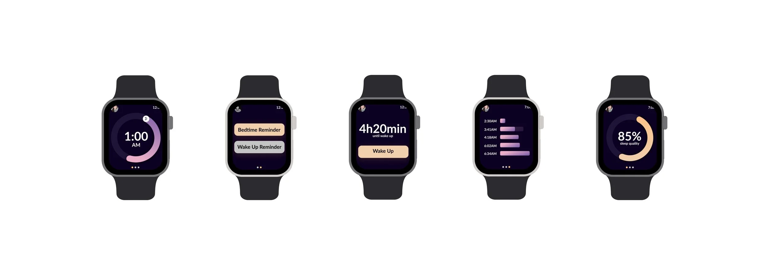
Completed cross-platform designs (phone, tablets, smartwatch)
Conducted multiple rounds of user testing for iteration
Overview
Nowadays, staying up late has become the norm for young people. However, irregular sleep routine often affects the health of the body, resulting in a lack of energy and attention during work and study. To solve this problem, in recent years, sleep management apps emerge in an endless stream. However, most of the sleep management apps have low customer stickiness. On average, users will lose interest and no longer use those apps within a week.
Results
I have designed a sleep management app called Bedtime, which provides an online sleep monitoring platform by introducing the concept of "partner". So that users can know their own sleep conditions and remind each other to fall asleep and wake up with a partner. This is the customer retention strategy I used to encourage users to use the app and achieve the purpose of increasing customer stickiness.
Problem Identification
In order to understand people's experience of sleep management apps, I conducted several user interviews and asked them about 1. the frequency and duration of using the app 2. the advantages and disadvantages of the app 3. their perspectives on sleep management apps.
According to the interview, I found that most users mentioned that they have tried more than one sleep analysis app, but they lost interest in them and stopped using them within a week. This shows that the biggest problem with the sleep management app is that the user stickiness is very low. They can easily acquire new users, but hard to keep the current users engaged.
Concept Exploration
Based on the user survey, I began to quickly conceive the concept, looking for a way to improve the user experience, so as to increase the user stickiness. I came up with three concepts:
Set the ranking board, encouraging users to use the app in order to increase the rank
Provide more comprehensive services, including creating a to-do list before bed / after getting up, etc., so as to enrich the features
Introduce a "partner" mode, let users remind each other to sleep and wake up
Then, I introduced these three concepts to the same users in the interviews. The feedback is obviously inclined to the third concept. They think that the first concept is too old-fashioned, the second concept is not very useful, but the concept of the partner is very fresh, which can well mobilize the enthusiasm of users. The third concept has also successfully attracted students in my UX class.
Therefore, I will focus on the third “partner” concept. The first and second concepts may be used in the future.
Concept Development
According to the concept of "partner", I define the partner as two groups
Familiar friends and relatives
Online users with similar sleep times
These two groups can complement each other to ensure that users can find the right partner.
The mutual reminder function between user and partner will be automatically turned on according to the sleep / wake-up time set by the user, and the user can also manually turn it off to ensure a quiet and undisturbed sleep. After the function is enabled, the user can click the button to send sleep / wake-up reminder. The reminders from a partner can be distinguished from the built-in alarm of the system, which is very intriguing.
Users can cancel the partnership at any time and then look for a new partner.
Features and User Flow
Based on the interview and concept development, I listed the main features in the chart and created a user flow.
UI Design
Sketching
I drew most of the mobile interfaces in the sketch, introducing multiple interactive actions between the home page and partner page.
Low-Fi Design
According to the feedback from the users, I decided on the new home page-partner page interactive way and designed the new gesture-based navigation.
Styling Guide
Considering that Bedtime, as a social sleep management app, needs to be both Inspirational and reliable, I set the overall style between lively and serious, so that the app can better attract users while creating a sense of trust. Besides following the trend of dark mode design, the use of dark purple as the main color can better protect the eyes and provide a sleep atmosphere. The remaining three colors of purple, pink, and yellow can bring a lot of vitality to the app. The Font, Lato, is formal but not that serious, which makes users feel more comfortable.
Hi-Fi Design Ver1
User Testing Round 1
I invited 5 college students to participate in this round of user testing. Before starting the test, I introduced Bedtime at first and provided them some background information: your name is Jessica Walker, and you have a partner named Richard Lee.
The participants should complete 4 tasks step by step and speak out their experience:
Complete a sleep cycle, from setting the bedtime alarm to waking up
Use sleeping aid to play a music
Send a bedtime reminder to Richard
End partnership with Richard and search for a new partner
Everyone could finish the first task very well and understand all the charts on the page of analytics. But in the second task, one of the participants said that he didn’t know how to open the sleeping aid because he didn’t know the horizontal bar implies the swipe-up. As for the third task, everyone could finish it but most of them(3/5) spent a few seconds to figure out where to tap. The fourth task was easy, too. But some participants stated that ending partnership should not be that easy because it should require the agreement between both users. Also, the button of ending a partnership is easily touched by accident.
While collecting the feedback from participants, I also gained many suggestions, such as dividing the settings and profile information on the page of settings. Based on the information I got, I started the first iteration of Bedtime.
Hi-Fi Design Ver2
The second version was much more detailed compared with the first version. It stripped away the useless information on the profile page and added the response request for canceling the partnership. Based on the user testing, I added new navigation: users can swipe left on the home page to the sleep analysis page. This would allow the users to read the sleep analysis whenever they want.
User Testing Round 2
This round of user testings was run on usertesting.com. Three participants were from the United States, aged between 30 and 60. While praising Bedtime's creative ideas and expressive visual design, they pointed out some problems and put forward very constructive suggestions.
Significant problems:
There are no tips about the navigation system
The icon for the profile page does not look like “profile“
The termination of the partnership should not require the consent of the partner
Main suggestions:
Add a notification or hint if your partner receives / reads your reminder
Change “Profile” page to “Settings” page
According to the feedback, my modifications are as follows:
Provide guidance about the gesture-based navigation when new users open the app
Change “Profile” page to “Settings” page
Cancel the mechanism that the user and partner have to both agree to terminate the relationship
Final Design


Reflection
UX designers and product managers are very similar. Excellent UX designers not only need to be able to design the interface but also need to design the function of the product itself according to the market and competitive products, so as to give full play to the advantages of the product
Gesture-based navigation, which is different from the traditional navigation bar, will make users confused and complicate the user's use process at first. But once the users have learned about how to use it, they will master it easily.
The main limitation of the cross-platform design is screen size, so different processes need to be designed to complete the same task on different devices
Sometimes the feedback of user testing is conflicting, so how to find a balance point becomes the key goal
Many of the proposed features don't need to be included at the beginning of the design, which makes a simple task too complicated.